An Introduction to Solar System Astronomy
Prof. Richard Pogge, MTWThF 1:30
|
|
Astronomy 161: An Introduction to Solar System Astronomy Prof. Richard Pogge, MTWThF 1:30 |
This page describes what the statistics of the exam scores mean, and describes in slightly technical detail how I compute my grade curve.
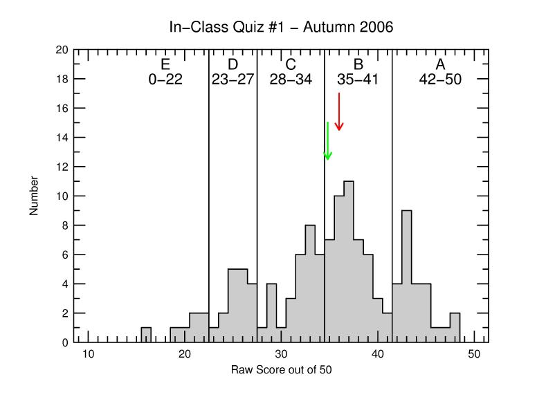
For each exam, I create a grade curve; a plot of the number of students who got each possible score (in this example between 0 and 50 points). The plot is in the form of a histogram or bar plot.
From this data, I compute the mean score, the median score, and the "spread" (or standard deviation) of scores. These are reported in the first part of each exam result report like this:
A large spread in a grade curve means that the scores were spread over a large range, making the curve wide and shallow. A large "tail" of low scores will also result in a larger spread in scores. A tall, narrow curve (small spread) means most people scored pretty close to the mean grade.
In the above example, the spread is 6.94 questions (13.9%), meaning a fairly normal grade curve (not too narrow, not too broad).
In the example above, the median was 36 correct out of 50 (or 72%), This means that half of the students scored a 36 or higher (and the other half score less than 36). For those of you who are familiar with "percentiles" (like on the SAT) the median gives the 50th-percentile score.
The median is another way of judging the class performance, since the arithmetic mean can be skewed slightly by having a number of very high or very low scores. If the curve has a long tail towards lower scores, as it the case here, then the median is a better measure of class performance than the mean. If the curve is a symmetric bell curve, the mean and median are the same.
In this example, the grade distribution curve is slightly lopsided towards low scores. This is why the median (36) is larger than the mean (34.81) about a whole question. The more lopsided a curve is (on either side), the greater the difference between the median and mean.
A grading curve is setup by defining which raw scores correspond to which letter grades. The divisions between the major letter grades are given in the Quiz Results Reports as the "Grade Cutoffs" that appear in the second half of each report. For example:
Letter grade cutoffs are determined by defining the mean score to be a C+ (a so-called "C+ curve"), and then subdividing the curve into regions for each grade (ABCDE). If the curve is very symmetric and bell-shaped, the width of each of the letter-grade "bins" will usually turn out to be about as wide as the curve spread (standard deviation). This usually works out to about 14-16% wide in most cases (as it does here).
However, I don't do this blindly using just the statistics. This is where the curving process becomes more involved...
One piece of guidance I have in setting up the curve is to consult the running statistics of historical performance on questions in our multiple-choice question collection (some of these data go back more than 25 years). If the class performs very well on the exam compared to previous classes, I usually elect to compute the curve more favorably by setting the mean score to be equal a high C+ or (in really good cases) a low B-. If performance is about average, so I use a C+ curve. This is the first complication. In this example, the class scored about 4% above the historical mean, and the high median (72%) means the median score was a B- instead of a C+. This means the class on average did rather well, with more than half the class getting between B- and A on the exam.
A source of complication arises if the point-spread is large (>16%). The most common cause is a curve with a long "tail" of low scores below the median, giving the curve a lopsided appearance. To diminish the impact of this long low tail on the scores in the central "core" of the curve, I adjust the widths of the bins. This is what goes into determining the rough dividing lines between letter grades. In all cases, I round the final divisions to a given raw score (you cannot get fractional points, on right or wrong, no in-between). I am given some guidance in how to make these divisions by examining the percentile statistics (e.g., 10% of the students get less than the 10-th percentile score, 90% get less than the 90-th percentile, etc.). These provide an additional quantitative handle on the spread of data within the curve. Usually, I find that a judgment based on the statistical mean and spread in the curve is more favorable to students than making blind percentile cuts, but it does serve as a decent sanity check on my grade divisions.
The final step in determining the grade curve is to review the detailed responses to each question. The grading program we use prints out the statistics for each question (i.e., how many students gave each of the different answers for a given question). What I am looking for here is whether a particular question "threw" most of the class. In general, any question that has response statistics much worse than the overall exam average will be scrutinized.
On rare occasions this review has helped to identify truly bogus or otherwise misleading questions. In those cases I will usually elect to summarily reject the question and recompute the exam grades retroactively. In the unlikely event that throwing out the bogus question would lower someone's the score, the original higher score is retained. This is a fairly rare occurance, maybe once every 5 years, but I check nonetheless.
I then assemble all the pieces and compute a final grade for all of the students. After a final review by hand of the calculations to check for problems, imbalances, etc., I assign the final grades.
I you want more details, see this worked example of the grading process.
As such, I make minor adjustments with rough quantitative guidance from the performance statistics so that the curves will be as fair and consistent as possible. My goal is to make the process as fair as possible so as to mitigate the otherwise impersonal situation in a large GEC lecture class.